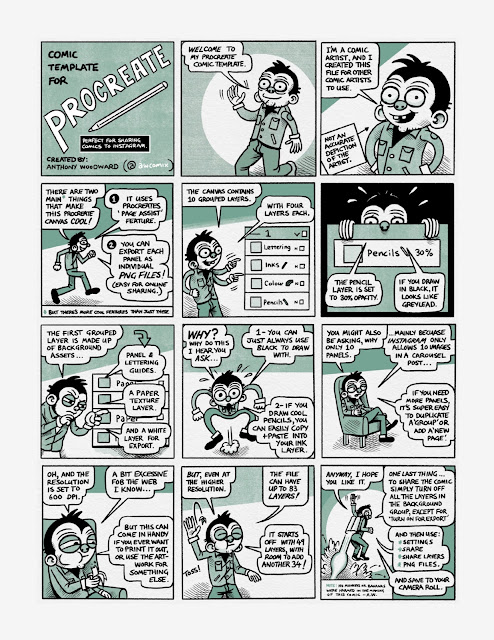
Lately, I've been experimenting with making comics quickly to share on Instagram. And when I find myself doing something on repeat, I like having ready-made templates to remove some of the friction of getting started when you have all the right layers and guides already set up.
Ever since I picked up the iPad app Procreate, I have discovered a new joy in making comic pages. It was tricky at first, however I have now drawn over 100 pages of comics and settled on a good layout system.
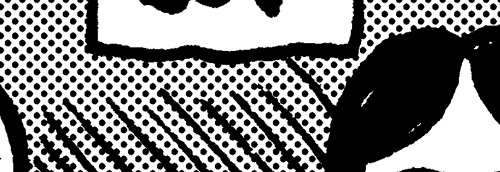
Also known as zipatone, Ben-Day dots, halftones etc For this tutorial a basic knowledge of Photoshop, colour modes, resolution, history and layers pallete, copy and paste functions will help. It is often desirable to achieve screen tones for artwork for either practicality or for effect. What ever you need it for I am going to show you the most effective way to achieve this using Photoshop. If you can master this, then there is no need to track down real zipatone and fiddle around with cutting it up. The middle section on ‘creating dot patterns’ is fixed although how you create your grey areas and how you use the dot pattern is up to you. Firstly this tutorial has nothing to do with the halftone pattern in the Filter menu. In my mind this filter gives a poor, hard to control, and fuzzy result. Which is not suitable when you need real screen tones for something like screen printing. Creating greys First open the artwork you want to add screen tones to; Be sure that this a
The problem of contrast and tone . One of the major concerns when drawing comics or images is that of tone and contrast. This is especially true of B&W drawings but to a lesser degree with colour. It is often referred to as ‘tangency’. When you do not have tangency, the lines that you have drawn blend into one another an become hard to decipher. The image is basically flat and hard to read. A/ This image doesn’t give us enough information; there is no contrast or line variation. B/ This is a little better, with some added line width, but still flat C/ This example is much better, there is line width, hatching and cross hatching, and areas of black. This helps us discern where the objects are sitting. D/ This example uses screen dots to create a grey tone that gives us contrast. Notice how I’ve placed the black differently in this picture. The picture is a little flatter than ‘C’ but still works. This method could be used for stylistic purposes. E/ In this example I have gone too
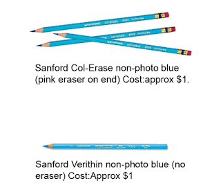
WARNING: Comic talk ahead! I wanted to write a short review of the 'non-photo' blue pencils I have been using lately. I'm doing this so that if you have to order these things through the mail or don't want to waste money trying and buying these things then hopefully this review will point you in the right direction. There are three pencils that I have come across. There are other types and brands, but these are the ones I have had experience with and I think may be the most commonly used in comics. 1-Sanford col-erase non-photo blue. (pictured) This pencil's lead is quite hard and hardly shows up on the paper. This is good if you only want faint marks as guidelines and not so much an actual finished drawing. There is an eraser on the end that actually works to a certain degree. Although it's really only for peace of mind as you don't need to erase the pencil after inking anyway. I found this pencil too light to do actual finished or rough outlined


Great comic. Love the dog :)
ReplyDeleteAwesome! I esp. like the panel where he's hiding in the bushes. And the dog is cool too!
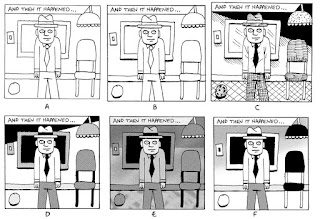
ReplyDeleteYou may notice the face in the bushes was used in my tutorial in making screen dots
ReplyDeleteIntense. The sixth (silhouette) panel is my favorite.
ReplyDelete