Thanks for reading...
Comments are always welcome. To subscribe via RSS, click here or sign up for my new publications' newsletter.
Popular Posts
Spinach Comic Book Template (UPDATED!)
Creating Screen tone effect in Photoshop
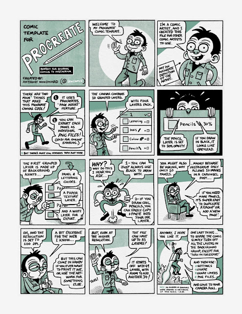
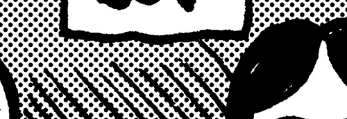
Also known as zipatone, Ben-Day dots, halftones etc For this tutorial a basic knowledge of Photoshop, colour modes, resolution, history and layers pallete, copy and paste functions will help. It is often desirable to achieve screen tones for artwork for either practicality or for effect. What ever you need it for I am going to show you the most effective way to achieve this using Photoshop. If you can master this, then there is no need to track down real zipatone and fiddle around with cutting it up. The middle section on ‘creating dot patterns’ is fixed although how you create your grey areas and how you use the dot pattern is up to you. Firstly this tutorial has nothing to do with the halftone pattern in the Filter menu. In my mind this filter gives a poor, hard to control, and fuzzy result. Which is not suitable when you need real screen tones for something like screen printing. Creating greys First open the artwork you want to add screen tones to; Be sure that this a
Making an ePub (Part One)
Around 2015 I started dabbling with making epubs. My interest was in making ebook comics and being able to distribute and sell them in bookstores around the worlds. After some initial trials I ended up publishing both George Bloop and Imagined Mysteries. It was a fun experience but I got busy with other projects and put it to the side.
Tangency
The problem of contrast and tone . One of the major concerns when drawing comics or images is that of tone and contrast. This is especially true of B&W drawings but to a lesser degree with colour. It is often referred to as ‘tangency’. When you do not have tangency, the lines that you have drawn blend into one another an become hard to decipher. The image is basically flat and hard to read. A/ This image doesn’t give us enough information; there is no contrast or line variation. B/ This is a little better, with some added line width, but still flat C/ This example is much better, there is line width, hatching and cross hatching, and areas of black. This helps us discern where the objects are sitting. D/ This example uses screen dots to create a grey tone that gives us contrast. Notice how I’ve placed the black differently in this picture. The picture is a little flatter than ‘C’ but still works. This method could be used for stylistic purposes. E/ In this example I have gone too
Comments
Post a Comment